Showing posts with label invitations. Show all posts

Tuesday, October 13, 2009

Rehearsal Invite Reveal...

Well, I’ve heard from one or two people regarding these, so I know that it’s safe to reveal them to you now. Without further ado, may I present to you our rehearsal dinner invitations? These were SO much fun to work on making. Really they were. I don’t know if they were just more fun, or if the pressure of having beautiful invitations was done and over with so these felt like more fun. Either way, I had a blast designing and creating these. And they really weren’t that much work.

As far as the design? I knew that I really wanted to use a belly band, since B won that one and we went without a belly band on the wedding invites. So I just didn’t ask him about having one on these...sneaky, I know. Other than that, I was WIDE open with what I wanted. I had a lot of envelopes (or so I thought) left over from our STDs and thought that if I did something in a size that would fit those, then that would be cool. Other than that? Wide open for suggestions.

And that’s when I remembered kind of liking Mrs. Apple Cider’s invitations for her rehearsal dinner...so I hopped on over to Weddingbee to check them out again and see what I thought. I realized that what I liked most about her invites was 1) the font that she used and 2) the graphics that she put in...so I started doing some searching using the links that she provided. I liked what I saw, but the doilies weren’t exactly right. So I kept looking, and eventually fell into the world of Photoshop brushes. I was hooked, and had the design done with only one evening spent at home working on it. Love at first sight? Possibly!

So here they are up close and personal...

The invitation itself... The Menu card (which I already showed you)... The RSVP card... The Map – I cheated and used my wedding map as a template and just moved everything a little more North and included the necessary information for the rehearsal dinner. In the end, I liked that I did that, since guess could see the proximity to the wedding venue, the hotel where they were likely staying and the rehearsal dinner restaurant. I forgot to make an extra map...so here's some screen shots of the file so you can kind of see... Like our wedding invitations, there were printed directions on one side, and a map that I made on the other.

All tied up with the pretty purple ribbon (image shown above).

And then, just because I could, I designed another graphic file to put my “stamp” on the outer envelope too. Yeah, I’m just that cheesy!

I ran the envelopes through the printer for all addressing needs... And then they just needed a stamp. I didn’t even have to ask B to get nice stamps when I sent him to the Post Office for stamps...he brought back the popular King/Queen set and they were gorgeous. I thought that they looked cute.

When my Mom got hers in the mail, she actually called me to tell me that she had no idea the depth of my creativity. And she thought the flowers on the outer envelope was a stamp...not a graphic that I designed in Photoshop. She loved them, to say the least. Even told me that I should open a business doing this...I agreed with her! I would love to do this for a living!

I don’t really have an accurate cost breakdown to share with you. I already had most of the materials that I used, or I used materials in conjunction with other projects. What I know that I specifically bought for them totaled to about $16. That doesn’t include the big pack of paper that I bought to do these and the programs on, but that will fall into my total paper projects budget. I made 20 invitations, so that makes them less than $1 a piece. Nice for this bride’s budget!

Are you going to DIY your rehearsal dinner invites? If you are, and you did your actual invites as well, did you have more fun doing these? Just wondering if I’m the only one that didn’t feel the pressure on this project.

Monday, October 5, 2009

Fun Times with Word Text Boxes!

So I’ve had a request from a reader to give a little more detail on how I made my invitations. Since I think that the request is geared more towards the design process than the part where I lined up the papers, mounted them and put it all together was more straight-forward, I’ll start with some tips and steps that I used to actually design the invites.

First and foremost, you need to know the size that you want to end up with. For me, this meant that I needed to figure out the size of the pocketfold first. Once I had that, then I would have a starting point for my invites. You should also consider the size of envelope that you want to work with, as that could be a factor as well. If you want to use an odd-size envelope (like square) then you might start there.

So, I’ll walk you through my process...

Once you have a starting size, open a new document in Word. 
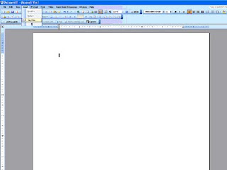
Then at the top of the screen, select Insert. From that drop-down, select Text Box. 
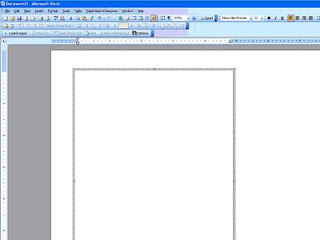
This will add a text box on the screen (you may have to click once or twice to get it placed on the screen). It will have a border, and probably be small in size, but those are things that you can change so don’t worry about it. 
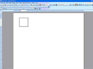
If you play with your mouse/cursor a little you’ll notice that the cursor changes shapes...when not on the text box it’s a normal arrow...when altering the WHOLE text box, it becomes a cross with arrows. This is important, because to make changes to the box, you have to place the cursor to where it changes to the cross with arrows and click to activate the whole text box. When the whole text box is selected, some dots and circles appear on the border of the box, instead of just lines to make the border.

Once the whole text box is selected, you can right click your mouse and a list of options appears.
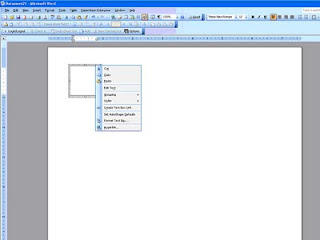
Select Format Text Box. This will open up a new box on your screen. (If you didn’t select the whole text box, then that selection will not appear from the menu. Go back and try to re-select the whole text box and try again.) There are several tabs across the top. The two that I mainly deal with are Size and then Colors and Lines.

First, let’s make the text box the right size. Click on the tab Size and input the height and width that you desire. For instance, if I’m making a 5”x7” invitation, I would put in 5” in the width and 7” in the height box. 
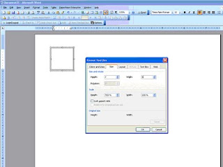
Now, if I was making a 5”x7” invitation that would be mounted on cardstock or some other paper, I would go a little smaller, like 4.75”x6.75” in order to make the matte a true 5”x7” and the invitation centered upon it. Does that make sense? You can enter in any size you want, you don’t have to use the up and down arrows that you see to the side of the size boxes. Once you get your size entered, click on “OK.”

Your text box immediately changes size to what you specified. Sometimes I get confused on which direction I want the box to run on the paper and I mix up my width measurement with my height measurement. No big deal. Right click the box again and go through the process just swap the measurements. Click OK and your box will re-orient.

Next, I would drag the text box to where I wanted it to print on the paper. This part was important to me, as I tried to get as much out of each sheet of paper as I could, so the layout of the boxes was muy importante. I would make all the text boxes for everything and then play with dragging and dropping to see what would fit together. Tip: If something doesn’t fit one direction, change the page layout to Landscape and try the boxes that way. If you go up to file and try to select Page Setup and find that it’s “greyed out” then you need to go back to your document and click OUTSIDE of the text box and then go back and try again. I ran into this time and time again...so hopefully that little tip will save you some headaches.

If that still doesn’t work, think about changing the direction that your text box itself lays. Lay it side-to-side instead of up-and-down, because text will print in any direction.

To move your text boxes to the edges of the paper and have it print successfully, you will also need to change the margins on your paper. Caution: Word does not like 0 margins...I learned that the hard way. You should usually leave .3” on all sides...Word stays happier that way. I take all my margins down to .3” just to maximize my paper, but that’s just my preference.

Once your text box is where you want it, it’s very simple to insert the text. Move your mouse/cursor inside the box and click. You’ll see a blinking cursor appear inside the text box and you’re ready to type away. Just like any document, you can fiddle with the alignment (left, right, center) and use any font and size that you want. Like I mentioned earlier, you can also have your text print in any direction. There’s a Text Direction option under Format at the top of your screen. Just be sure that you’ve clicked inside the text box that you want to change, and then select how you want your text to print.

Just be careful about staying within your border. If it doesn’t show in the text box, it’s not going to print on the paper either! You can mix alignments, font and font sizes until you’re satisfied with your final product. You cannot mix text directions within ONE single text box. But you CAN lay text boxes up against each other (or even slightly on top of each other) if you wanted some words to print one way and others to print a different direction. Just practice with it and you’ll figure out how you like it.

Once you’re happy with what’s inside your text box, I would change the border. For my own taste, I’m cutting most things out and choose not to have a printed border. But, borders can be fun and a neat and tidy way to close your text box. Remember my petal bags? 
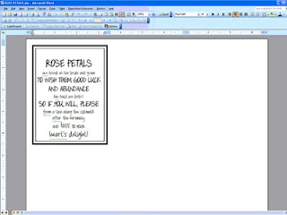
I used two text boxes to get those two borders, and it worked great for that project. But for my invitations, I was cutting them all out, so I didn’t want lines. But I did want some cutting guidelines...

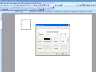
To get cutting guidelines, I just right clicked the whole text box (cross with arrows) and selected Format Text Box. Using the tab titled Colors and Lines, you’ll find two important features. 
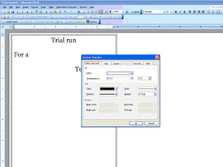
The Fill feature and the Line feature of your box. Let’s talk Line first.

You can change the color of your Line/Border to anything that Word can create. You can also change the style of the line, making it whole, dotted or dashed and several combinations of the three. And last, but not least, you can change the thickness. For cutting guidelines, I selected a light grey color, a dashed line and a thickness of just .75. 
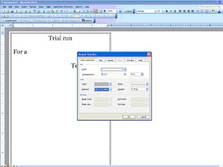
That made faint lines that I could barely see (in some instances) to use to guide my cut. See? You can barely see them...and I had to make those at 1.25 in thickness just so they would show up here. But they weren’t dark enough to still show badly if I didn’t cut exactly perfect either.

Play around with it and see what you prefer. You have to click OK to see the changes in the border, just like seeing the changes in sizing earlier.

The other thing that I mentioned that you can find on the Colors and Lines tab was the transparency of your text box, or Fill. There is a sliding adjustment bar in this box that allows you to make your text box non-transparent, semi-transparent or transparent and all degrees in between those options. Just slide it around and play with it...I personally prefer all of my text boxes to be transparent (slide all the way to the right), but once again that’s my preference only.

If you’re using two text boxes to achieve a double boxed look (like petal bags) then the text box on the outside will need to either be made transparent to show the inside box through it, or you can play with the order of the boxes, bringing one forward or sending one backward to achieve the same goal. I think that it’s easiest to make one transparent, so that’s why I told you that way. But just know that there are other options to achieve the same goal.

The last thing that you’re going to want to do is a test print. You always, always, always want to do a test print. I cannot stress this step enough! Every printer is unique and different, and reacts differently to different types of paper and margin settings. Just because the text box shows to be fully on the piece of paper on the screen with the entire text showing does NOT mean that it will print that way. Many times, I would do my test print to see the bottom ¼ inch of the text box missing. Usually simple to fix, just drop and drag the text box up one or two clicks. Other times, you may have to get more creative than that...

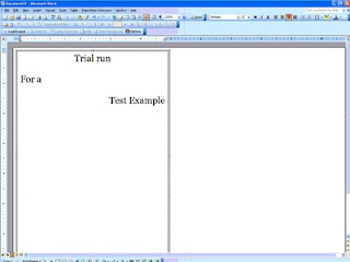
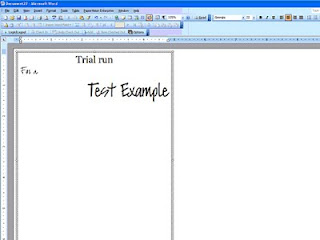
So that’s it in a nutshell. You can also do most of this in Power Point, I believe. I’m not as familiar with Power Point, which is why I chose Word. But after the first trial run project created this way, I had really learned the ropes and ALL of my paper products were designed in Word by moi. And the first trial run wasn’t hard by any means, but it was frustrating...my boxes kept moving and disappearing and I couldn’t find them again...but just keep at it and you’ll get the hang of it, I’m sure! 
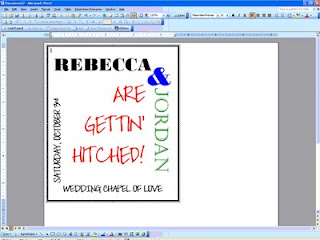
Before long, you’ll be able to make something like that! Well hopefully, yours will be MUCH prettier, but I was trying to illustrate that a little practice will do wonders for your skill level.

Next up? We’ll talk about adding clip art or images into text boxes (think maps!) which requires a whole post to itself! I hope this helped answer some questions...if you have more specific questions, feel free to email me or comment below and I’ll get back with you one on one.

Monday, September 21, 2009

The "Waiting Game"

Oh my goodness...other brides are right – checking the mail is SO much fun! No, not everyday is fun, but when you’ve spent countless hours working on your invitations, and then you send them off in the mail, you start to anxiously await the RSVPs in the mail. Other brides have written about how much fun they have going to the mail box, and they’re right! It’s a blast.

You see, I don’t normally check my mail everyday. We have a PO Box in town near my office for most of the bills, and then get mainly junk mail at home. So, I try to stop and collect the bills once or twice a week and then we check the mail box at the house even less frequently. Until now! Now, I’m checking that bad boy each and every mail day!

For the first few days it was one or two at a time. Then one day I got none. The next day there were three...and the following day there were EIGHT! I was so excited to take each one home and check it out. See who was planning on attending and who might not be. And this was a big question for us, because like most brides out there today, I invited more people than we really have space for at our venue. I figure this is ok, since the average acceptance rate is around 75%, right? Even though I know this, and I’ve talked to plenty of other brides, friends, family and vendors...I was still sweating when the first 15 or so RSVPs were all marked “yes.”

That’s good news, don’t get me wrong. But I’ll also admit that there was a little sigh of relief to get a few that were marked “no” as well.

But let me ask you this question. Now that the initial rush seems to be passing, is it normal to experience a lull or lag in responses? There are still almost two full weeks before the deadline that was printed on the RSVP passes, but I didn’t get one single note all weekend long. Not Friday. And not Saturday. That is perplexing to me. I have a theory though, and to me it seems that the longer people wait to respond back...the greater the chance is that they’re not coming. Did you find that to be true?

The bride inside of me that over-invited is a little relieved. But the bride inside me that wants a good turn-out is a little worried. I think that it’s normal to get a rush of responses right at the beginning and then a rush of responses more towards the deadline...but this waiting game is killing me! Lucky for me, when I collected addresses to build our database, I also collected phone numbers and email addresses. Yes, I fully expect to have to track people down to get an answer out of them. And that’s ok. I was one of those people for Maid Britney’s wedding last year. I’m a tad bit ashamed to admit the fact now, but I was one of those guests that had to be emailed (or IMed) to see if we were attending or not.

Now that I’m the bride, and I know all that rests on the number of guests coming to your wedding, I don’t think that I’ll ever be that person again. I vow right now to always send my RSVP in before the deadline...and as soon as I can, to be honest.

Did you experience this too? A rush of RSVPs hitting your mailbox right away...and then a little pause? How many people did you have to “track down” to get an answer our of? Just wondering...

Thursday, September 17, 2009

The Invitation Budget...

So where did I leave off? Oh yeah, wiping the drool from my chin as I admired my invitations...that's awfully rude of me!

I just love them soooo much - you'll forgive me right? I hope so!

To be perfectly honest, I don’t know that I could have gotten an invitation suite so elegant and classy for the price that I paid to make them myself. You know that I’m not going to leave you without a cost breakdown, so here it is:

Invites:
Black cardstock paper - $44.91
Stardream Opal cover weight paper - $40.54
Stardream Opal text weight paper - $40.47
100 Postcard stamps for RSVPs - $28.00
2 Replacement ink cartridges for printer - $24.87 each
Postage @ $.61 each to mail - $49.80
Various items: such as embossing ink, black embossing powder, quote stamp, tape runner refill cartridges – all reflected in grand total

Tools needed: embossing gun, tape runner, paper cutters (large and small) all already owned. Also the scroll stamp was used in SO many other paper projects that it’s cost was just absorbed in my overall paper goods budget, not reflected here.

Pocketfolds:
Previously posted the cost breakdown, found here

Envelopes:
Stardream Opal 6x6 square envelopes - $40.00
(The actual price was $20.50 more for a rush shipment, remember that boo-boo? But B said that I shouldn’t count that in my budget since he offered to pay for that expense out of the wedding budget. Thanks, B!)

I think that’s it. Seems like a lot, huh? I had enough material to make 100 invites (I only made about 85) and I have plenty of material left over for all of the other various paper projects that I have planned.

The grand total came to $378.41, as close as I can estimate.

That’s $3.78 per invite.

Not bad, if you ask me. But since you didn’t ask me, I will be honest and say that I did NOT shop around online for prices on invitations that were done by someone else. This is one DIY project that I always knew that I would do. So I don’t really have anything to compare that price to. I think it’s good, but then again, I’m a bit biased on this subject!

How did you feel about your invites once they were all done? Was it worth the struggle and headaches that they might have caused along the way?

Wednesday, September 16, 2009

The Invitations Close-Ups

The last big decision that I made regarding the invites was the inner envelope. I had just assumed that I would have one. With the pocketfold being Black Stardream, that meant that the inner envelope would be Opal Stardream (matching the paper) and the outer envelope would be Black Stardream again. A nice tie in, I thought. Until I realized that I can’t print on Black Stardream envelopes. Hmmm...yes, there were several solutions.

1 – do the “calligraphy” trick that so many bees and other brides have posted about, like here
2 –use address labels for both front address and return address on back
3 – use a wrap around label on the outer envelope that I could design and print on my Opal Stardream paper to match again

Well, I can tell you that I didn’t like the look of regular address labels. Even if I could make them cute somehow, it just seemed off. The thought of hand writing all 80 invitations didn’t appeal to me either. I got on board with the wrap-around label idea, but B nixed it right away. Wouldn’t even consider it, which led to a discussion about why you needed two envelopes. He had good points; I have to give it to him. He won this battle. There would be NO inner envelope, which would allow the outer envelope to be Opal Stardream and printing would commence directly on the envelope. But what to do about differentiating who the invitation was addressed to? On the outer envelope? That thought didn’t appeal to me. And although, in most cases, the entire household was invited, there were a few invites where I felt the need to specify who in the house was invited...and of course, you needed to invite your plus ones, right? I didn’t like the idea of putting “& Guest” on the outer envelope...I know that doesn’t make much sense, but these are my invitations and I have to allright with it all.

So I came up with the idea to print and mount labels on the pocketfold itself. We were already adding our monogram and a quote that we felt was appropriate to the outside of the pocketfold, why not add one more thing? And since they all wouldn’t be on the same place, it was a perfect solution. I had originally thought to put the label on the back of the pocketfold, but MOH stopped me. She made the valid point that not everyone opens their mail the same way. Who’s to say how they would open the invite and how they would pull it out of the envelope? They could open it in such a way that they would miss the label entirely...and the nightmares started up again of massive amounts of people showing up. Luckily, we agreed that mounting the label above the monogram on the front of the pocketfold where they were SURE to see it was an ideal solution. Placing the quote on the flap beneath was a no-brainer. It reads “Once in a lifetime, someone comes along who changes everything.” It was a stamp that I found early on during the planning process at Hobby Lobby and I knew that it HAD to be in our wedding. You see, being an encore, sometimes you think that you’ll never marry again. That you would rather live alone for the rest of your life than in the situation that you left. You don’t expect to meet someone and get a second chance...that’s the stuff of movies, right? Wrong. Sometimes in real life, you do get another chance. Sometimes in real life, you meet someone and everything that you thought you knew changes in an instant. This quote was perfect for us!

So you get your invite out of the envelope (carefully not throwing the envelope away because it’s SOOOO beautiful!) and you see your name and our monogram. You open up the flap (it’s not tied or tacked down in any way) and you read our quote, which most will understand since these are close family and friends only, no strangers here. Folding that flap down you see our invite in the middle and the pocket full of inserts below. Each insert’s title is carefully shown...and all information is displayed nicely...but I’m biased! You find your written Directions on the largest insert, with a note that there is a Map on the reverse side... And turn it over to see the CUTEST map ever made by me! (Yeah, yeah. So it’s the ONLY map I’ve ever made – whatever!) Next, you have your Accommodation instructions about the room block that we’ve got and the expiration date on those rooms. I also included the hotel’s street address (for GPS users) and 1-800 phone number to call, along with our group code, to make the reservations. This insert is just mounted on black cardstock. And last, but not least, is the RSVP insert. It has our deadline date in bold...along with a place to mark yes or no and how many guests we can expect. Then on the reverse side, just our mailing address and the discreetly placed RSVP#.

Here’s the whole set with the outer envelope displayed as well.

I love it. Plain and simple. There just aren’t any words to describe the pride that I feel for these invites. I would do this for a living...except not on that Stardream cover weight paper and my printer EVER again! LOL.

Monday, September 14, 2009

Designing the Invitations

Well, let’s see. It began with lust for pocketfolds. And lust for these invitations. And these. And really, these. I loved the idea of having inserts, and instead of bundling them together somehow, I lusted and craved pocketfolds. So I made them, and couldn’t be more pleased with how well they turned out. What I thought would be the tricky part, was actually the easiest part.

Once I had the size of my pocketfolds set in stone, I was ready to design the inserts and invitation, since you need the paper sizes first. I had found a stamp at Hobby Lobby/Target on clearance that became the “mark” of our wedding. It went on everything, and will continue to pop up with more and more project reveals. It was a scroll design that was curvy enough to satisfy me, but not too swirly to disappoint manly B. It turned out to be a great compromise. And I knew from the beginning that I wanted an invitation with that scroll image in the corners. Or at least one corner, since putting it in two corners was a little on the girly side from the world according to B. It was just pure chance that I decided to use the scroll to emboss the outside of our STD envelopes. (You can see them here!) I was really just learning how to emboss, and those were my first attempt. I thought that if that process went smoothly enough, then embossing my own invitations would be a piece of cake. And yes, the embossing turned out to be the easiest part of the whole wedding invitation project.

I designed all the templates in Word, mainly because I’m lazy. I probably could have used Publisher or Photoshop (I have both), but I’m not as comfortable working there as I am in Word, and text boxes are a breeze to manipulate. The main concern for me was getting the most out of each piece of paper, which meant small margins and problems with printing to the edges that I would find out about later. Since I was worried about spacing, I didn’t just print the invite on one page and the inserts on another...no, no, no. I came up with the “best” layout that allowed me to print one invitation (invite and ALL inserts included) along with two favor tags with just two sheets of paper – one heavy and one light. I thought that the design part of the process would be difficult, but it really wasn’t. Finding the fonts from here and here, and finding the paper from here and here was actually very simple.

It was the printing that nearly killed me! (I won’t go back into it, if you want to catch up, here are the links: 1, 2, and 3.)

But when it was all said and done, the RSVP insert and the Map/Directions insert and the favor tags were all printed on the heavier cover weight Stardream Opal paper. While the invite, the Accomodations insert, the monogram, and the quote were all printed on the text weight Stardream Opal paper. This type of paper will be used throughout the wedding with all printed elements, to tie it all together...and because I love it SO much!

How did I figure out how much paper to order? I’d really like to tell you that it was a scientific formula that when used in these circumstances will give you an 85% accuracy rating…but in reality, I just got lucky. When I ordered the paper, I had originally thought to fit one invitation suite per page, and placed my order based on that. I’m not really sure WHAT I was thinking, or how I ended up with enough paper, because there was NO way that you could print an invite and three inserts on one sheet of paper! I must have been smoking crack that day...

Either way, I ordered 125 sheets of cover weight paper to do the invites, and I ordered 250 sheets of 80 lb plain black cardstock paper to do the mounting on. (You see, I’m a scrapper...and mounting is the theme that runs through ALL of my scrap books!) Then, when I realized that not everything would be mounted, so not all the paper needed to be cover weight, I placed an additional order (several months later) for 250 sheets of Stardream Opal text weight paper, knowing that I would use this paper for other projects as well.

I had originally envisioned each insert being mounted on the black cardstock, so I’m not sure why I ordered only cover weight paper in the Stardream Opal. Once again, smoking crack, I guess. But remember people, crack kills...and should NOT be used while planning a wedding or designing invitations! LOL.

I just worked with my design and re-worked my design until it all worked together or until it all fit. Aligning the text boxes front to back on pages of a Word document is easier than it sounds, but thank goodness for test pages. There were a LOT of test papers printed in this process! I had so many "mock ups" done that I didn't know what to do with them all. Once I had it down to what I was happy with, I was ready to print. And that’s when I ran into my problems. But we’ve already discussed those and how I dealt with them...

And the good news is that the text weight paper went through the printer fine – no problems what-so-ever. If I had had problems with that paper too, I think it would have been the death of me! After about a month of wrestling with the printer and messed up pages, I was done. I had a stack of cover weight pages printed, and a stack of text weight pages printed, along with a stack of pocketfolds all ready to be assembled together into my invitation suite.

For those of you who decided to DIY your wedding invitations - was the design process the easy part or the hard part for you?

Saturday, September 12, 2009

Pocketfold Reveal

Oops! In getting ready to reveal the invitation suite to you all, I found this post about my pocketfolds that I made. I forgot to post these pictures from a looooong time ago. Maid Britney and I worked on these back in April, when I was in Dallas for a week with meetings for work. I didn’t want to reveal them too early or anything...so I kept them to myself. And then forgot that I never posted about them! LOL. Too funny. So here are the pocketfolds that I made. I really, really loved pocketfolds, as I posted about here, and wanted them badly. But I didn’t like the high price tag that was also associated with them...so I sent about making them myself. In that post written so long ago, I theorized that I would be able to make them for $.06 a piece following these basic instructions. Let’s see how good I did, shall we?

First off, I had to decide on paper. Then I had to find it in a length and thickness that I could live with for the price. To make the invites in one continuous sheet, I had to purchase paper that was oversized. But being oversized has it’s plusses as well – I found out that I could get 4 pocketfolds per sheet of paper, and still have a good remainder cut left for another project at a later time. (Yes, I’ve saved those scraps all these months...just waiting to re-use them!) In hindsight, I wish that I had gone with a slightly heavier weight on the paper, but that’s hindsight for you – not a big deal, just a personal preference. I went with what was recommended, so I can’t complain.

The problem with oversized paper? It has to be cut down. And I can barely walk a straight line, much less cut one...so off to Kinko’s I went. I had heard (or read) somewhere that Kinko’s would cut down oversized paper, and I had all the dimensions that I needed handy. Maid Britney and I set off, and came to an abrupt halt. Yes, the guy behind the counter at Kinko’s told me, they could cut the paper for me, but it would be $1 per cut...and with 3 cuts to a page...and 25 sheets to cut...yeah, you’re doing the math aren’t you? I was, and I was NOT going to pay $75 for cutting charges. Then he flashed his charming smile and said the magic words: “Or you can use our cutter for free and do it yourself.” Magic words, I tell you.

Once the cutting was done, Maid Britney and I went back to her apartment and set up our assembly line. First things, make the template out of something heavier than my copier paper taken from work. (Gasp! The horror!) Using some cardstock that she had leftover from her own wedding, Maid Britney quickly made a template that showed us where to cut in and where to cut out to form the pocketfolds. We fell into a pattern. She traced. I cut. We repeated this process about 100 times. And we were very, very BAD...we took NO pictures of this process! Shame on us!

Next, I notched off where the scores needed to be made for folding and we tried one just to see how it worked. Note to all other brides out there attempting this: Invest in the $4 bone folder. It’s worth it. Enough said. After I notched where the folds needed to be made, Maid Britney dutifully went back and scored the creases for me. By this time, it was getting late...so I assured Maid Britney that I could put the double-sided tape on myself at a later date.

Fast forward a week. Yes, they sat there like that, just half-finished for a full week. I spent a few nights in front of the television with my small paper cutter and a pair of scissors, measuring and cutting the strips of double-sided tape to make the pockets out of.

Following these instructions (that I liked even better), even buying the brand of tape that she recommended, the process was simple. I measured off pieces of tape about 3” long, about 15 at a time, and then would go about putting them sticky side down along each side of the pocket.

Then, I could simply peel off the top protective layer to the tape and a clear piece of double-sided tape was left to create the pocket with. This was a pretty painless process. Other than a little eye strain that I inflicted upon myself trying to line up the tape as close to the edge as possible without going over the edge. Yes, I’ve said it before, and I’ll say it again – OCD, much?
All in all, the process was fast, painless and produced great results. Were all the pocketfolds exactly straight? No. Did I notice when I assembled the invitations four months later? Not really. (OK, I’ll be honest, I DID notice a few and simply went back and corrected the top fold with my bone folder. Problem solved!) Were they gorgeous and totally worth the money and time spent? Hell, YES they were! Big impact, low cost – always good in my book.

Here’s the cost breakdown for you:
Oversized paper: $39.90 (25 sheets)
Double-sided tape: $9.71 (had to buy 3 rolls)
Bone folder: $4.33

(Paper trimmer and scissors were the only other materials used, and I already owned them.)

That brings the total cost to $53.94. I made 100 of them, not knowing how many I would need in the end, which makes each pocketfold $.54 a piece. I think that I was pretty close in my estimate back in March! (Of course, that doesn’t factor in my time and labor!)

Do you like the look of pocketfold invitations? Did you crave them (like me) but didn’t want to pay the outrageous price for them? Did you try to do them youself? How did they turn out?

Friday, September 11, 2009

Save the Dates...A Little Late!

Haha. The joke’s on me!

When I sat down and started working on the posts for my lovely invitations, I realized that I never revealed my Save the Dates! Yes, I showed you the magnets that I made and even provided some instructions for making them...and I even went so far as to show you a mistake that I made on one of the envelopes...but I never showed you the actual Save the Date! The shame...and horror...so, better late than never right? Hope so!

Without further ado, here is our Save the Date:

Outer envelope
Postcard – front Postcard – back That’s it. Easy, simple and to the point.

I designed the postcard using Adobe Photoshop, but looking back at it now, I can see that it was obvious that I was just learning what Photoshop was all about...it was a very simple design. Nothing too complicated. I know how to do soooo much more now, six months later. Oh well.

Let’s see. I used the pictures that B had used during his proposal to me (missed out on that? here you go!) so that all of our friends and family could re-experience a little of his thoughtfulness. And really, who doesn’t want to show off their cute kids? We do!

I also included a picture of the two of us on the front with the date and a little cutesy saying that he and I came up with and agreed on, that continued onto the back design. The back was left clean and simple so that it emphasized the magnet. I was in LOVE with the magnets, and didn’t want anything to detract from them!

I used a coupon that I found online and ordered the postcards from overnightprints.com for a steal. I’ve still got half a box of postcards that I don’t know what I’ll ever use them for...but the price was right, who was I to complain? I simply attached the magnet to the backside of the postcard in the ample space that I left open and viola! They were done.

I went the practical route and bought cheap envelopes from Office Depot. I knew that they would just end up in the trash, so I couldn’t justify spending too much on them. In hindsight, I wish they had been just a little bit better quality, with a little more thickness to them. But oh well, they went in the trash, right? Right.

I found a font that I liked here, joehand2 and used it to create a mail merge from my Excel address spreadsheet. Ironically, many people who know my handwriting thought that I actually addressed the envelopes, as the font was similar to my own writing. Bonus points for me!

Then I decided to practice with my new embossing tools and stamp set that I had bought specifically for the invitations. Yes, I know that these were just the Save the Dates, but I thought that it would be a nice tie in to the rest of the paper products, while also allowing me a practice run to see if I really wanted to tackle DIY-ing my own wedding invitations.

After a few small hiccups at first, I got the hang of embossing quickly. There’s not much to it...but a word of warning: you have to use EMBOSSING ink...archiving ink will NOT work. Just in case you’re like me and go the cheap route the first time around. You’re just creating more work for yourself, trust me!

All in all, I was VERY pleased with our Save the Dates, and received many, many compliments on them. I was proud to say that I made them, and they left me looking forward to working on my wedding invitation suite.

Here’s a cost breakdown:
Postcards from overnightprints.com – $30.94
Magnets – $20.95
Paper – $22.51
Adhesive – $5.40
Envelopes - $8.65
Postage - $34.60

Grand total: $123.05
Cost per STD: $1.23


I mailed our Save the Dates out somewhere around the six month mark. We were not getting married on a holiday weekend, and there were just a handful of out-of-state guests, but a lot of guests that would be driving in for the event. I know that it wasn’t really necessary to do them, but I really wanted to. There were just so many cute ones out there to follow, and I thought that it would be a good practice run before attempting the actual invites. Doing them stretched the Stationary portion of our overall budget, but I’m happy that I did them and satisfied with the end product!

Did you choose to do Save the Dates, even if you didn’t technically need to do them? Why did you make that choice?

Thursday, September 10, 2009

The BIG Reveal...

I’ve been soooo excited to reveal the invites to you! I know that I’ve showed you some sneak peeks here and there, but nothing major. The invitations were officially mailed out a week ago, and I’m starting to receive some RSVPs in the mail, so I think that it’s pretty safe to show them off now...but now that the moment has come, I have to admit that I don’t know where to start! I guess the beginning would be the obvious answer, huh? Smart alecks...but once I got started explaining it all, it got to be kind of long, so we’ll break it into several posts, if that's cool with you all.

First up, the big reveal. The finished product. My pride and joy.

Sitting in a pile, all assembled and awaiting the right sized envelopes... A close up of the actual invite, before it was attached into the pocketfold...Some "left overs"...The suite all together, assembled:The whole suite, unassembled:I promise that individual recaps of this process are coming soon...including process, steps and budget breakdown.

Until then, what do you think so far? I know it's hard to tell right now without close-ups...coming soon!

Friday, September 4, 2009

Sneak Peek!!

So I posted this post the other day about being worried that my envelopes were a little, shall we say...plain? Unadorned. Undecorative. And ugly also work. Well, ugly is a little to the extreme side of things, but you get my drift – I wasn’t quite happy with them. But then I thought that maybe, just maybe, I was being a little too much about the whole situation. So I snapped a quick picture with my crack-berry...and sent it off to MOH to peruse.

Sure enough, she wrote back and was PC about it all and just said that the envelope was a little plain. Leave it to her to find the right words! Plain is ok – plain is fine. Plain is not acceptable, but I can work with plain and even had a plan in mind. Don’t just take our word for it...see for yourself. It just lacks...something. Panache, maybe. I don’t know. And yes, that was a messed up one that I used to find the exact right placement for the printing, but then I didn’t have to blur the image, which I just hate to do. So that night, I set to work to make the outer envelopes prettier and I had my favorite helper there to lend a hand.

When I sent out our Save the Dates, I had bought plain cream envelopes, which also needed a little “dressing up” in my opinion, so I had the materials all available that I would need to dress up the invitation envelopes as well. I used an acrylic stamp (the same stamp that adorned the invite) and some black embossing powder and my handy embossing gun and set to work. (I found on the Stardream paper line that the colored embossing powder actually worked better than the clear, just FYI!)

Of course, when I started pulling everything out, J was VERY interested to see what I was going to be working on. Her interest was followed by an immediate “Can I help, Mommy?” with the saddest big brown eyes that have ever been turned on a Mom. Of course you can. Here’s some shots of her in action...
I didn't blur this picture, she wouldn't stay still once she figured out that I was taking pictures of her! And PLEASE ignore the mess in the background...wedding central!

She really, really, really wanted to be the one pouring the powder onto the stamped image but she settled for inking the stamp and lining up the powdered envelopes in a row on the floor while they awaited our heat gun. She tried to convince me more than once that she COULD do it...but I’m a meanie and I held firm.

Once all the envelopes were stamped and powdered, I used the heat gun all at one time. It just seemed easier that way to me, to do them in assembly line fashion. Plus, by this time in the evening it was bathtime for J and she didn’t bug me about using the heat gun, which DOES get a little warm.

Laid out overnight to set and dry (even though it’s probably not necessary) and this is what I had the next morning...Aren’t they beautiful? *sigh*

Now it was just a waiting game on the post office to get me those stamps...because you HAVE to admit...the stamp just MAKES it!

Was it worth the evening that I spent doing this? I think so. What do you think? Did you "dress up" your outer envelopes too?

Wednesday, September 2, 2009

Here They Go...

I'm SO excited! I just can't contain it any longer, and I have to share it with you! What's that? Oh, that's just little old me...sitting at a mailbox...dropping the first of my wedding invitations into the mailbox!

YEA!

Does everyone want to do a group cheer? How about a group hug? Anything?

OK, maybe not. Maybe no one out there is as excited about this shin-dig as I am, but I'm just about to burst at the seams with excitement. Literally.

So here's what happened. After posting here about the stamp dilemma, I had some extra time on my lunch hour. And what does a bride with extra time on her lunch hour do? That's right! I went to my local Post Office. I waited in line, not so patiently as the line was VERY long, until it was my turn at the counter. I politely asked the postman if he could tell me if they happened to have any of the Wedding Cake $.61 stamps available.

This is when he said, yes he could tell me.

And then nothing.

This is not a joke, Mr. Postman. This is serious business. No, I see that I didn't wear my "BRIDE" shirt today...hang on, let me go get my horns and veil out of my trunk! Along with my pitchfork to prod you into action with. This is no joking matter, as the friendly postman was quick to catch on to. He told me that he would be more than happy to look for me, and he quickly walked to the back counter.

And then this is what he tossed out over his shoulder to me - "But we have lots of $.61 stamp options available for you to choose from."

No, you must REALLY not get it. I am a B-R-I-D-E. This means that I have slaved and sweated over what are essentially my "children" and I do not want ANY $.61 stamp. I want the Wedding Cake $.61 stamp. Is this getting easier for you to understand. Are you picking up what I'm laying down?

Instead of saying all of that out loud (see, I told you I was having a VERY good week in self-restraint!) I nicely told him that I didn't want any other stamp, just those stamps. He smiled at me, and said ok. But it was a smile that had a big "whatever lady" behind it. Hey, whatever I have to do to get the stamps, right? Lucky for him, he came back with one sheet. When he asked me how many sheets I needed, I told him 4, but that I would take whatever he had and order the rest online.

I made my purchase, and quickly left. But he was very friendly at the end and even offered to place the order for me! See...it does pay to be a bride. A smiling one, anyway.

So I left with my 20 coveted stamps, and just about cried in the parking lot. They are THAT pretty. Seriously. The picture online doesn't do them justice. Anyway, I came home that night and decided that the envelopes were a little plain. Yes, they were pretty, but I wanted them to be spectacular. So I spent some time jazzing them up after my workout and in between cooking dinner and taking a bubble bath.


Some detail for you of my favorite part, the embossed scrolls...Sorry for the quality of the pictures, I was out and about when I thought to take this and just had my crack-berry along for the ride! I'll have better pictures of it and my "little helper" tomorrow!

This morning, when I woke up and they were all dried, I selected the invitees that were located the further geographically from us, and those are the 15 that went into the mailbox today. The rest will go in as soon as I get the rest of my stamps in, hopefully today or tomorrow. They are all assembled, printed, and stuffed into envelopes...patiently awaiting a perfect stamp to complete the ensemble.

How did you feel when you mailed out your invites? I realize that I might be doing this a little bit backwards to be doing it in stages, but I just couldn't resist getting at least 1/4 of them in the mail on my "deadline" date!

Monday, August 31, 2009

Postage Options

So, I’m a girl. And a girlie girl at that. Honestly, if I have to pay a little bit more for something to look better, in my opinion, it’s totally worth it. I don’t lie about this. It’s part of who I am. Accept it, embrace it, and move on.

This little quirk of mine also applies to our wedding. More specifically to our wedding invitations. Now that the suite is finished, I did what I said that I would do, and I brought a finished invite to work with me to weigh it in today...this was smart before I go and buy the stamps, right? Right.

I reverently placed MOH’s invite on the postage scale and held my breath. It read out that I would need $.61 of postage to mail my babies off. (Yes, I just called my invitations my children. When you’ve worked this hard and slaved and worried over them for as long as I have, they’re like family!) After finding that out, what is the first thing that you think that I would do when I got home?

If you guessed checking USPS online to see what stamps options are available, you’re RIGHT! I logged in real quick and took a peak at the “Additional Postage” options out there. Here’s what I came up with:


source of all images


My favorite? The wedding cake. That one comes in right at $.61, which makes it perfect for my budget. I know what you’re asking yourself right about now...well, S, if the design is great and the postage meter says that’s how much postage you need, then what’s the problem? Why the long post?

Here it is. I haven’t embossed the outer envelope. I wasn’t sure that I was going to, but after seeing it all together, it looks a little plain to me...I think that it needs a little something to punch it up a little bit, and our scroll stamp is perfect. Since we used it on the outer envelopes for our Save the Dates and it’s on the actual invitation, it’s the perfect thing to dress up the envelope a bit. But what will it do to the weight of my invitation? Do you think that it would be enough to tip the invite into a higher postage bracket? I don’t know.

I see two options. #1) Cross my fingers, toes and anything else that can be crossed and hold my breath while I emboss one and then re-weigh it tomorrow on the postage scale. Pray to the heavens above that my little stamp and embossing powder will NOT add enough extra weight to the suite to cause me to need more postage. #2) Go ahead and buy a different stamp that has extra postage built into it. There are several that I like, and maybe B won’t have an opinion...oh wait, who am I kidding? I’ve got the world’s most opinionated groom in history! And I LOVE it! Don’t take that the wrong way honey and get defensive!

What’s your vote? What would you do? The other thing to consider is that the post offices might not have the actual stamp that we select, and I’ll have to order it. Granted, it only takes two days to get here...but that would put me past my own deadline...decisions, decisions, decisions. Such is the life of a bride!